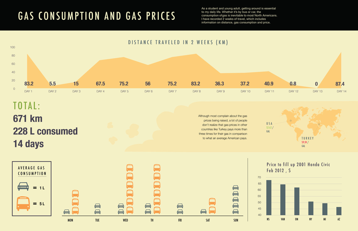
Gas Consumption
This is an infographic that I designed that displays my average gas consumption in the span of 2 weeks. I collected data on gas prices and fuel consumption in the vehicle that I travel in as well as gas data in other parts of the world. The data displays my 2 weeks of travel through distance and price.
This project was not to only show my personal gas consumption but also draw a broader picture in how price and distance correlate with each other. Allowing the viewers to think about how much gas they consume and how much they are paying for it bi-weekly.